

Choosing the right color for your walls can be stressful. Many homeowners fall in love at first sight with detailed street scene paintings but hesitate to buy them. What’s their biggest concern? They worry that the intricate lines and deep tones of old-town street scenes will clash with the minimalist, modern style of their apartments.
Matching your home’s color scheme with detailed urban art doesn’t require deep expertise—it just takes a little thought when it comes to placement.
This is particularly evident when selecting urban art themes for the home. Unlike traditional landscapes or neutral decorative art, urban artworks often feature stronger contrasts, architectural forms, bold colors, and modern compositions. The right piece can give a room personality, while the wrong color combination can make an expensive artwork look out of place in the room.

Interior designers are increasingly viewing artwork as a key element in shaping a room’s visual style. Current discussions in home design also indicate that trends are gradually shifting from purely neutral tones toward richer hues, expressive colors, and spaces dominated by artwork.
This guide will explain how to evaluate the colors in town wall art, avoid common pairing mistakes, and select pieces that complement your home environment.
Follow the 60-30-10 Color Rule
Professional interior designers typically follow this timeless 60-30-10 color rule to avoid a cluttered, uncoordinated decor—and this rule is equally effective when selecting urban-style wall art. The formula is simple: 60% of a room’s color scheme comes from wall paint and large furniture pieces, 30% from secondary furnishings such as sofas and rugs, and the remaining 10% is reserved for accent details—including your wall art.
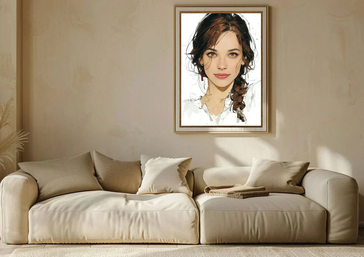
If your home uses neutral colors as the 60% base palette (such as white, beige, or light gray walls), you’ll have the greatest flexibility when selecting urban-style wall art. Urban artwork in soft tones—depicting warm golden sunsets, richly layered street scene shadows, and reflections on water—can add subtle depth without overwhelming the clean, minimalist base palette. For rooms with bold primary colors like navy blue or deep charcoal gray, we recommend choosing urban art pieces with bright highlights and light-colored backgrounds to achieve the perfect color balance.
Why is color coordination important when choosing urban art? Many buyers first focus on the artwork’s subject matter—such as the New York skyline, city streets, industrial architecture, or abstract urban landscapes. However, color often determines whether the artwork will blend seamlessly into your room.
A cityscape dominated by deep blues and cool grays creates a completely different impression than one accented with warm oranges, reds, and golds. Before selecting a piece of art, consider the following three visual elements:
| Element | Question to Ask | Why It Matters |
| Wall Color | Is your wall warm, cool, light, or dark? | Determines whether artwork blends or contrasts |
| Furniture Palette | What colors already dominate the room? | Prevents visual competition |
| Room Purpose | Is this a relaxing or energetic space? | Helps choose the right emotional tone |
A common mistake is to pair decorative art exclusively with a single piece of furniture, such as a sofa or rug. A successfully designed room is typically achieved by coordinating several smaller color relationships, rather than simply replicating a single exact shade.

Start with Your Existing Home Color Scheme
Rooms with Neutral Tones Need Artwork with Personality
Many modern homes use neutral tones as their base:
- White walls
- Beige sofas
- Gray floors
- Natural wood furniture
While these spaces are versatile, they can sometimes lack a visual focal point. For interiors with neutral tones, urban-style artwork can add a pop of color to the space without requiring a complete room makeover.
For example:
| Room Style | Recommended Urban Art Colors |
| Natural wood interior | Green, earth tones, warm city scenes |
| Gray modern apartment | Navy, black, metallic tones |
| White minimalist space | Bold red, blue, or monochrome artwork |
| Beige or cream living room | Terracotta, brown, muted orange |
A single eye-catching piece of art can set the color tone for a room.
For homeowners who love contemporary urban design, NovPop Urban Art Collections offers artwork featuring themes of modern environments, architecture, and urban landscapes.
How to Choose Color Schemes for Urban Art Based on Different Room Types
1. Living Room: Choose Artwork That Creates a Visual Focal Point
The living room is usually the area that attracts the most attention from guests, making it an ideal spot for large urban art pieces.
A large urban painting hung above the sofa should create a visual connection between the wall, furniture, and decorative items.
Recommended pairings:
| Living Room Style | Artwork Direction | ||
| Modern apartment | Black, white, metallic, geometric city artwork | ||
| Industrial loft | Brick tones, charcoal, steel colors | ||
| Contemporary home |
|
||
| Minimalist interior | Simple compositions with limited color palettes |
Based on our research into interior design and our observations of the current art market, homeowners are increasingly inclined to choose artwork that reflects their personal style.
Carefully curated pieces like the Venice Sunset Painting can transform a blank wall into a meaningful design focal point.

2. Bedroom: Choose Urban Artworks with Softer Tones
The bedroom typically requires a different design approach. Colors with too high a saturation can create an overwhelming visual impact, whereas urban scenes with relatively softer tones complement a sleep environment perfectly.
Good choices include:
- A city skyline in soft shades of blue
- Buildings at night
- Monochromatic streetscapes
- Atmospheric urban photography
In the bedroom, we should choose artwork that complements the style of our existing bedding and lighting.
3. Home Office
Home offices often benefit from a more distinctive visual style. Artwork with an urban theme is particularly well-suited, as cities often symbolize creativity, ambition, and innovation.
A workspace decorated with architectural artwork or pieces featuring modern urban themes can create a professional atmosphere without feeling as rigid as a traditional office.
Warm Colors vs. Cool Colors: Which Urban Art Style Suits Your Home?
Color temperature has a significant impact on how artwork complements interior design.
1. Urban Art in Warm Tones
Warm colors include:
- Orange
- Red
- Gold
- Brown
- Reddish-brown
They pair exceptionally well with the following elements:
- Wooden furniture
- Leather sofas
- Vintage-style interior decor
- Cozy and comfortable living spaces
Urban art in warm tones often creates a richer, cozier, or more nostalgic atmosphere, especially when combined with architectural themes.
2. Urban Art in Cool Tones
Cool tones include:
- Blue
- Gray
- Black
- Silver tones
They complement the following elements perfectly:
- Modern apartments
- Glass furniture
- Minimalist interior design
- Industrial-style spaces
Cool tones are particularly common in contemporary urban design because they blend naturally with buildings constructed of concrete, steel, and glass.
Should Artwork in a City Home Match the Wall Color Exactly?
It doesn’t need to match exactly, and this idea is a very common decorating misconception. In fact, matching the colors exactly can actually make the artwork blend into the background. A better approach is to focus on color relationships. A professional interior designer will typically recommend using complementary colors, analogous hues, and moderate contrast.
For example:
| Wall Color | Artwork Choice |
| Dark gray wall | Bright city artwork with white or metallic accents |
| White wall | Strong contrast urban painting |
| Beige wall | Warm architectural artwork |
| Navy wall | Artwork with lighter city elements |

Pairing Street Art with Different Interior Styles
Recommended:
- Geometric compositions
- Monochrome cityscapes
- Architectural motifs
- Industrial-style interior design
Recommended:
- Factory-style scenes
- Concrete textures
- Dark color palettes
- Minimalist Interior Design
Options:
- Simple compositions
- Limited color palettes
- Clean lines
For homeowners who prefer architectural styles with a stronger local character, town-themed wall art can also connect urban design themes with familiar neighborhood landscapes, making the artwork more personally meaningful—rather than merely decorative.
Choose Artwork That Suits Your Personal Style
When selecting the right urban art paintings for home, start with your existing color scheme, define the home style you want to create, and choose artwork that adds a unique touch to your space.
A carefully selected urban art painting does much more than simply decorate a wall. It will become an integral part of your everyday living environment.
Frequently Asked Questions
Q1: How do I choose urban artwork with the right colors for my living room?
First, identify the dominant color scheme in your living room. Choose artwork that complements these colors. Avoid selecting a piece simply because one of its colors matches your sofa.
Q2: Should wall art match the color of the furniture?
No. Artwork doesn’t need to match the furniture perfectly. We recommend pairing pieces with similar tones but varying shades to create overall cohesion while maintaining visual interest in the space.
Q3: Are urban-themed artworks suitable for minimalist interiors?
Yes. Minimalist interiors often benefit from urban-themed artworks, as clean architectural lines and restrained color palettes can highlight the homeowner’s personality without creating visual clutter.
Q4: What size of city-themed artwork should be chosen to hang above a sofa?
For most sofas, the artwork’s width should typically be about two-thirds of the sofa’s width. For larger walls, a single oversized piece usually creates a better effect than multiple unrelated smaller pieces.
Q5: Can personalized city-themed artwork be used as home decor?
Yes, and it’s a very popular choice right now. Personalized city-themed artwork can add a unique touch to your living space.

Leave a comment
This site is protected by hCaptcha and the hCaptcha Privacy Policy and Terms of Service apply.